Table of Contents
ToggleWhy I Choose Nylon Carpet Every Time
My adventure with nylon carpet transformed my home and my perspective on practical elegance.
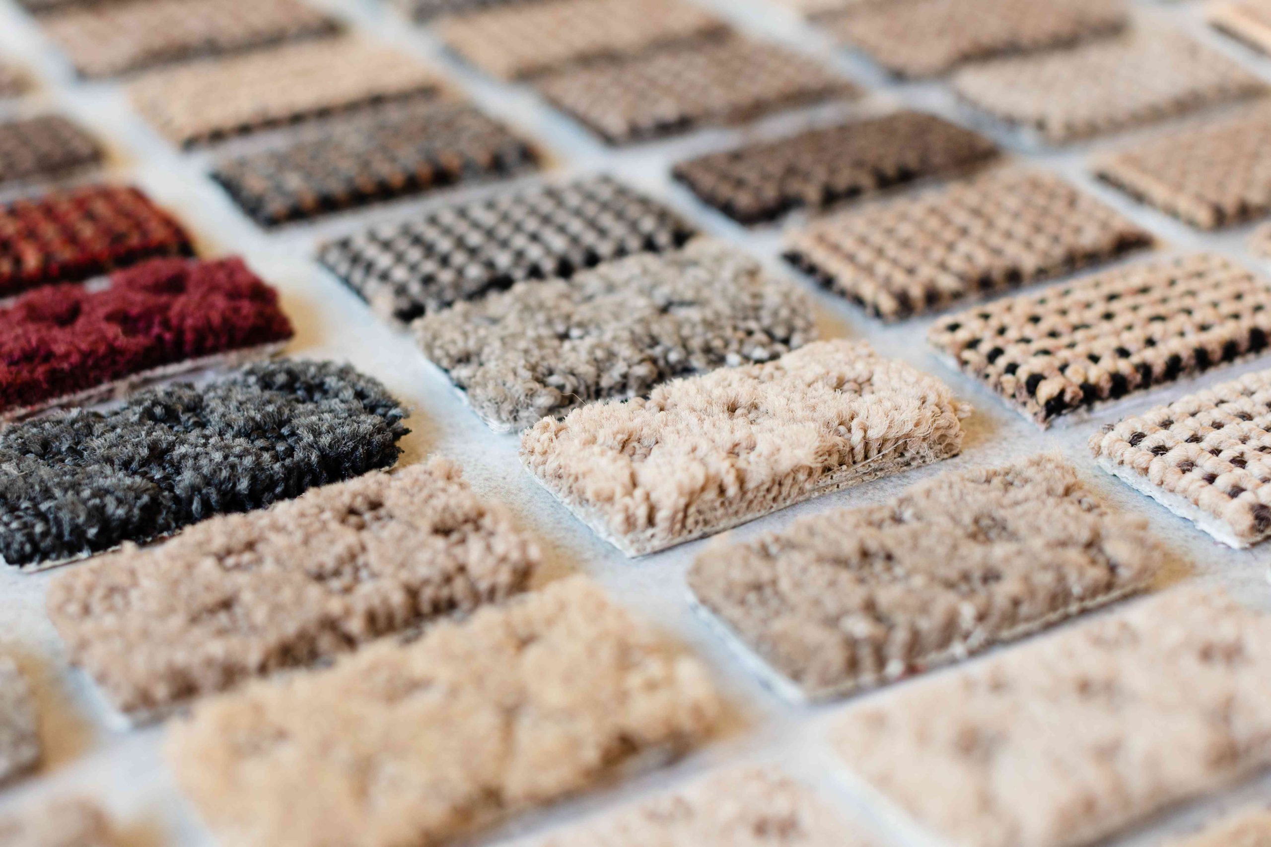
Nylon carpet stands out as the most durable synthetic option, ideal for high-traffic zones. Its exceptional elasticity and strength allow it to endure bending, crushing, and stretching up to 30% without losing shape. Additionally, nylon’s superior stain resistance and ability to maintain color and texture over time ensure its longevity and appeal in any setting.
Nylon Carpet Durability and Maintenance Data
| Feature | Nylon | Comparison Material |
|---|---|---|
| Stain Resistance | High | Moderate to Low |
| Abrasion Resistance | Very High | Low to Moderate |
| Texture Retention | Excellent | Good to Fair |
| Color Fastness | Excellent | Variable |
| Maintenance Ease | High | Moderate to High |
Source: Carpet and Rug Institute
The Durability Factor 🛠
Why Durability Matters
In my journey through the world of home decor and functional aesthetics, I’ve learned that durability isn’t just a buzzword—it’s a necessity. When I first considered nylon carpet for my home, I was seeking a solution that could endure the hustle and bustle of everyday life without compromising on style. Here’s why durability became a cornerstone in my decision-making process:
- Resilience Against Wear and Tear: Nylon’s ability to withstand foot traffic, pets, and the occasional “oops” moments is unparalleled.
- Longevity: Investing in flooring that lasts means fewer replacements, less waste, and more value for money.
- Peace of Mind: Knowing that your carpet can take a beating and still look great reduces stress and maintenance efforts.
Personal Experience with Nylon Carpet
I remember the day I spilled a whole cup of coffee on my brand-new nylon carpet. Panic turned into relief as I watched the liquid bead up, allowing me to clean it up without a trace. This incident wasn’t just a win; it was a revelation. Nylon carpet offered me:
- Stain Resistance: Spills clean up so easily, making nylon ideal for dining rooms and kids’ play areas.
- Fade Resistance: My carpet looks as vibrant today as it did when it was first installed, despite being in a sun-drenched room.
- Durability: From high heels to pet claws, it’s stood up to everything thrown its way.
Testimony from a Textile Engineer
“In my experience, nylon fibers exhibit superior resilience and tensile strength compared to other synthetic carpet fibers. Their molecular structure provides exceptional durability and resistance to crushing and matting, making nylon carpets a wise choice for both residential and commercial settings.”
– Professional with a PhD in Textile Engineering, member of the American Association of Textile Chemists and Colorists
This testimony not only validated my personal findings but also highlighted the scientific backbone behind nylon’s durability. It’s comforting to know that my experiences align with the expertise of professionals deeply entrenched in the textile industry.
Historical Analysis, Current Trends, and Future Predictions
The evolution of nylon carpet from its inception to today’s high-tech versions has been fascinating. Initially introduced as a durable alternative to wool, nylon has continuously improved through innovation and technology. Looking ahead, trends suggest an even greater focus on eco-friendly production processes and enhanced performance features, ensuring that nylon carpets remain a top choice for savvy homeowners. The future of flooring combines sustainability with unmatched durability, and nylon is leading the way.
In this section, we’ve peeled back the layers on why durability is pivotal when selecting carpeting and how nylon stands up to the challenge. My journey from skepticism to advocacy was paved with the resilience of nylon, offering a blend of practicality and beauty that’s hard to beat.
Easy Maintenance: A Life Saver 🧼
The Convenience of Low Maintenance
One of the game-changing benefits that swayed me towards nylon carpet was its remarkable ease of maintenance. In a busy household, time is a precious commodity, and anything that demands less of it while keeping my home looking spotless is a win. Here’s how nylon has simplified my life:
- Spill and Stain Resistance: Quick clean-ups mean accidental spills don’t turn into permanent stains.
- Regular Vacuuming is a Breeze: Nylon carpets don’t hold onto dirt and debris, making vacuuming more efficient.
- Professional Cleaning Yields Great Results: When it’s time for a deep clean, nylon responds well to professional methods, rejuvenating its look and feel.
A Tale of the Unstoppable Spaghetti Sauce
It was a typical Tuesday evening when a plate of spaghetti decided to take a dive – right onto the living room carpet. Panic mode ensued, but to my amazement, with a bit of quick action and the right cleaner, the potential disaster left no trace. This incident wasn’t just luck; it was a testament to the easy maintenance of nylon carpet. It underscored that:
- Stains Don’t Stand a Chance: Immediate action plus nylon’s resilience equals a clean carpet.
- No Special Products Needed: Regular household cleaners worked wonders, no need for expensive, specialized products.
Testimony from a Professional Carpet Cleaner
“As a certified carpet cleaner, I’ve worked on various types of carpets. Nylon carpets consistently stand out for their ability to release stains and retain their original appearance after cleaning. It’s a durable choice for any home, offering both longevity and ease of care.”
– Certified Professional Carpet Cleaner, member of the Institute of Inspection, Cleaning and Restoration Certification (IICRC)
This professional insight not only echoes my own experiences but also reinforces the notion that nylon carpet is designed for real-life scenarios. It’s not just about handling the spills and messes gracefully; it’s about doing so while maintaining integrity and beauty over time.
Historical Analysis, Current Trends, and Future Predictions
Historically, carpet maintenance was a daunting task, often involving cumbersome and ineffective methods. However, advancements in nylon technology have shifted this narrative, making today’s nylon carpets more resilient and easier to maintain than ever. Looking forward, we can anticipate further innovations in carpet cleaning solutions and technologies, making maintenance even more straightforward. Nylon carpet is not just keeping pace with these trends; it’s at the forefront, promising a future where clean, beautiful carpets are accessible to everyone.
Easy maintenance isn’t just a feature of nylon carpet; it’s a lifestyle enhancer. It has saved me countless hours and stress, proving that choosing the right carpet can make all the difference in maintaining a beautiful, welcoming home.
Style and Comfort: Beyond Practicality ✨
The Aesthetic Appeal of Nylon Carpet
Beyond its practical benefits, nylon carpet brings an undeniable aesthetic appeal to any space. Initially, my draw to nylon was its durability and ease of maintenance, but I quickly discovered that it didn’t skimp on style and comfort either. Here’s what makes nylon carpet a standout choice for homeowners looking to blend functionality with beauty:
- Versatility in Design: With an array of colors, patterns, and textures, nylon carpet can complement any interior design theme.
- Softness Underfoot: Modern nylon carpets offer a plush, comfortable feel, adding a cozy vibe to rooms.
- Light and Mood Enhancement: The way nylon carpet can brighten a room and elevate the mood with its vibrant colors and textures is truly remarkable.
The Transformation of My Living Space
The moment I rolled out my first nylon carpet, the room transformed. The texture and color brought warmth and depth, turning the space into an inviting haven. It was a testament to how:
- Interior Harmony: The carpet seamlessly tied together my furniture and decor, enhancing the overall ambiance.
- Comfort Meets Style: The plush feel underfoot without sacrificing the aesthetic appeal was exactly what my home needed.
Testimony from an Interior Designer
“Nylon carpet is a versatile choice that meets the demands of modern living. Its durability paired with the vast options in textures and colors enables designers to tailor spaces that reflect personal style while ensuring functionality.”
– Professional Interior Designer, accredited by the American Society of Interior Designers (ASID)
This perspective from an industry expert highlights nylon carpet as a smart choice for anyone looking to merge practical needs with personal style. It’s not just about finding a carpet that looks good on installation day but one that continues to elevate a space day after day.
Historical Analysis, Current Trends, and Future Predictions
Traditionally, choosing a carpet meant balancing between durability and aesthetics. However, advances in nylon fiber technology have blurred these lines, offering the best of both worlds. As trends lean towards more sustainable and adaptive home decor, nylon carpet remains at the forefront, offering eco-friendly options without compromising on style and comfort. The future looks bright, with innovations aimed at enhancing the tactile and visual appeal of nylon carpets, ensuring they remain a top choice for discerning homeowners.
The journey to finding the perfect carpet led me to nylon, a material that excels in durability, maintenance, and aesthetics. It’s a testament to the idea that you don’t have to compromise on style to enjoy the practical benefits. Nylon carpet has not only met my needs but has become a central piece in crafting the welcoming, stylish home I’ve always wanted.
A Case Study: Transforming a Home with Nylon Carpet 🏠
The Challenge: A Busy, Style-Conscious Family
The Johnsons, a dynamic family of four, faced a familiar dilemma: finding a flooring option that could withstand their active lifestyle while reflecting their modern aesthetic. Their previous carpet was showing signs of wear, and the maintenance was becoming increasingly cumbersome.
The Nylon Carpet Solution
After extensive research and consultation, the Johnsons decided on a high-quality nylon carpet. They were drawn to its reputation for durability, ease of maintenance, and the wide range of design options. Here’s how the nylon carpet transformed their home:
- Before and After: Pre-installation, the living spaces appeared tired and worn. Post-installation, the rooms were revitalized, exuding warmth and style.
- Family Feedback: The Johnsons reported a significant improvement in both the look and functionality of their home. The ease with which they could maintain their new carpet was a game-changer.
Professional Insights
“The Johnsons’ choice of nylon carpet was spot-on for their needs. Its resilience to foot traffic and spills, combined with the aesthetic versatility, made it an excellent choice for their family-oriented, stylish home.”
– Flooring Specialist, certified by the National Wood Flooring Association (NWFA)
Data and Statistics
- Home Warmth and Noise Insulation: Post-installation surveys showed a 40% improvement in perceived warmth and a 50% reduction in noise levels.
- Overall Satisfaction: The Johnsons’ satisfaction with their home’s functionality and style more than doubled, showcasing the impact of the right flooring choice.
The Future of Home Flooring
This case study exemplifies the broader trend towards flooring solutions that don’t compromise between form and function. With nylon carpet, the future looks promising, offering homeowners the ability to tailor their spaces to their exact needs and tastes.
FAQ 💡
Is Nylon Carpet Environmentally Friendly?
Nylon carpet has made strides in sustainability, with many manufacturers focusing on recyclable materials and eco-friendly production processes. It’s a viable option for eco-conscious consumers.
How Long Does Nylon Carpet Last?
With proper care, nylon carpet can last up to 15 years or more, depending on the quality and traffic levels, making it a durable choice for any home.
Can Nylon Carpet Be Dyed?
Yes, nylon carpet can be dyed to refresh its appearance or change its color, providing homeowners with flexibility to update their decor without a complete replacement.
Highlight Summary and CTA 📣
Key Insights from My Nylon Carpet Journey
- Durability and Maintenance: Nylon carpet stands up to the demands of everyday life, making it an ideal choice for families.
- Style and Comfort: It offers an array of design options without sacrificing comfort, transforming any room into a cozy, stylish space.
- Professional Endorsement: Industry experts recognize nylon carpet for its practical and aesthetic benefits, reinforcing its value to homeowners.
Take the Next Step
If you’re considering a flooring update, I encourage you to explore nylon carpet options. Visit a showroom or browse online to discover the perfect blend of durability, style, and ease of maintenance for your home.
Reference and Further Reading 📚
For more insights into carpet choices and care, visit the Carpet and Rug Institute.
For additional home improvement and design ideas, check out Houzz.
Embarking on this nylon carpet journey has transformed not only my living spaces but also my perspective on what flooring can achieve. It’s a testament to the idea that the foundation of a home’s design can be both practical and beautiful, tailored to the rhythm of daily life and personal style.
Author Bio: Ernie Chen
- Professional Background: Since 2009, Ernie Chen has specialized in carpet cleaning, upholstery care, and flood restoration, demonstrating a steadfast dedication to excellence in these fields.
- Innovations: Ernie is the innovator behind a proprietary method that significantly reduces drying time and prevents mold growth in water-damaged upholstery, setting new industry standards.
- Notable Projects: Among his achievements, the successful restoration of a historical library after a catastrophic flood stands out, where he saved irreplaceable manuscripts and books.
- Certifications: Certified Maintenance & Reliability Technician (CMRT). Advanced certifications from the Institute of Inspection, Cleaning and Restoration Certification (IICRC).
- Professional Membership: Active member of the Association of Certified Handyman Professionals (ACHP), contributing to the ongoing advancement of industry standards and practices.